
Aletheia Fashion
A social platform to review, find and share outfit ideas
Lots of university students are struggling to find outfit ideas on school-day occasions or special events like career fairs. They also find it hard to look for similar outfit solutions specialized for them. Let me take you through the journey of my experience building Aletheia for an opportunity to possibly solve the needs of college students.
I proactively identified the design opportunity, proposed, initiated and led this project from end-to-end, including design research, information architecture design, prototyping, and user testing. I worked closely with user researcher Madeline Xu to conduct user interviews and define product requirements.
TEAM
Zhiwen Qiu, Melinda Xu
YEAR
2019
PROJECT TYPE
Academic Side Project
MY ROLE
User Research, UX Design,
App Development
Problem
I found that some of my friends were talking about their limitations in the wardrobe and that didn't know what to wear for business events or attending conferences. They were also struggling to expand their horizons of outfit ideas as current products are always single items and rarely provide solutions for creating personalized looks that combine clothing items.It is crucial for us to understand the needs of different types of users.
Competitor Analysis

ASOS
-
Up-to-date design system, shop the look and occasion categories
-
Lack customized look recommendations and solutions
-
Has trending information on occasions and recommendations for customers
-
Has aggregated look with items breaks up
-
Lack pictorial demonstrations for looks
NORDSTROM

Renttherunway
Stitch Fix
-
Occasion recommendations for clothing
-
Comparison for similar items
-
Clean category breakdown and pictorial contents for users
-
Has style quiz that increases match for users
-
Actively refine style preferences for users
-
Provide monthly packages for the look, but maybe lack interaction for users
User Research - First Round Interviews
The preliminary study led us to develop two primary questions to inform research goals and objectives:
1) Who are our potential users? (female students?)
2) What are their motivations, needs and pain points for online shopping - if they do, and how they find outfit ideas?
Being aware of the habits of the given target demographic was crucial to our understanding of the problem space. Madeline and I conducted a user interview, evaluating and interviewing 12 individuals within our target demographic of 20–30 year olds on their online shopping habits, preferences, and dislikes. Sample questions are as follows:
-
Can you describe your most recent shopping experience/fashion-related purchase?
-
How do you plan your outfits daily/ in special occasions?
-
What are the most important factors that influence your purchasing choices when shopping for clothes/accessories?


Affinity Diagram
Interview Insights
Second Round Interviews
The first round of interviews led us understand the behavioral patterns of our users and we found:

We explored further how students find their styles and opportunities to think about with the following objectives:
-
How do students find their own style? (mobile app, websites and etc.)
-
How can we help them better/discover their own style through our product?
-
What’s the best way to purchase clothing? Directly on our own website or links to third party fashion brands websites?
-
Is a "style quiz" necessary for users to discover the outfit ideas?
-
What are the systems needed in the product: social media and shops?
Synthesize Information & Personas
Analyzing from the user interviews, I gained in-depth understanding of the key structures to be considered inside the system and generated three personas along with user flows.

Transcript Excerpts


Information Architecture
The personas and research insights informed us to make a simple, easy to use task flow that matches the needs for three types of users of the product,
-
"Passive Users" who use the product without purposes and browse through collections and trending topics;
-
"Active Users" who have specific purposes to look for outfit with occasions/ mood or products relate to their personal wardrobe and preferences.
-
Users who would like to share their insights and ideas of "looks".

Ideation
I quickly moved to sketch out several wireframe options with solutions tested upon:
-
What are the components in the home/ search pages and how to display "looks" in order?
-
How to manage contents through posts of looks and products?
-
Under search, how can the options of keywords and photos be more suggestive for targeting results?
-
How would "notification" and "account" be different from normal to accommodate two systems?
-
When in product page, how to show multiple images - slideshow? What if this is a look?


Low Fidelity Wireframes
After understanding the visual structure and languages, I moved to low-fi wireframes to highlight the important elements in each screen based on the task flow and be cautious about the dimensions and spacing between the elements.

Hi-Fi Solutions: Home
A portal and introduction for the whole app. The home page not only shows "outfit" feed from the community, but also has trending topics and recommendations for users. Each post have "message", "like" and "collect" options to be easily saved in wishlist and boards.

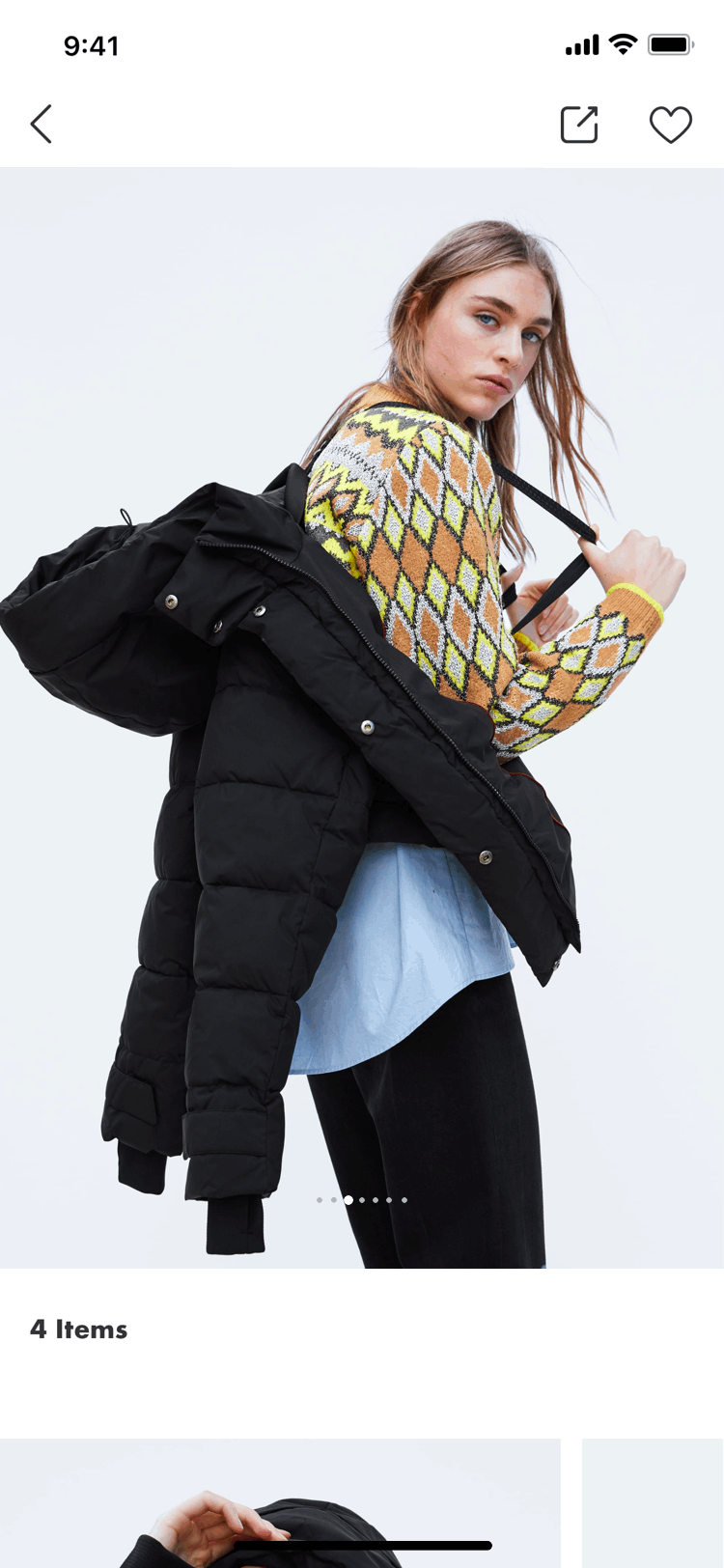
Post
One of the biggest features is to showcase the outfit "look" for various occasions. When user taps into the post, there are descriptions and model demonstrations of what and how the look is, followed by "hashtags" of uploader's model information and others for users to determine whether or not this is suitable for him/her. They can also read comments from other people to get a better understanding of how they look works.

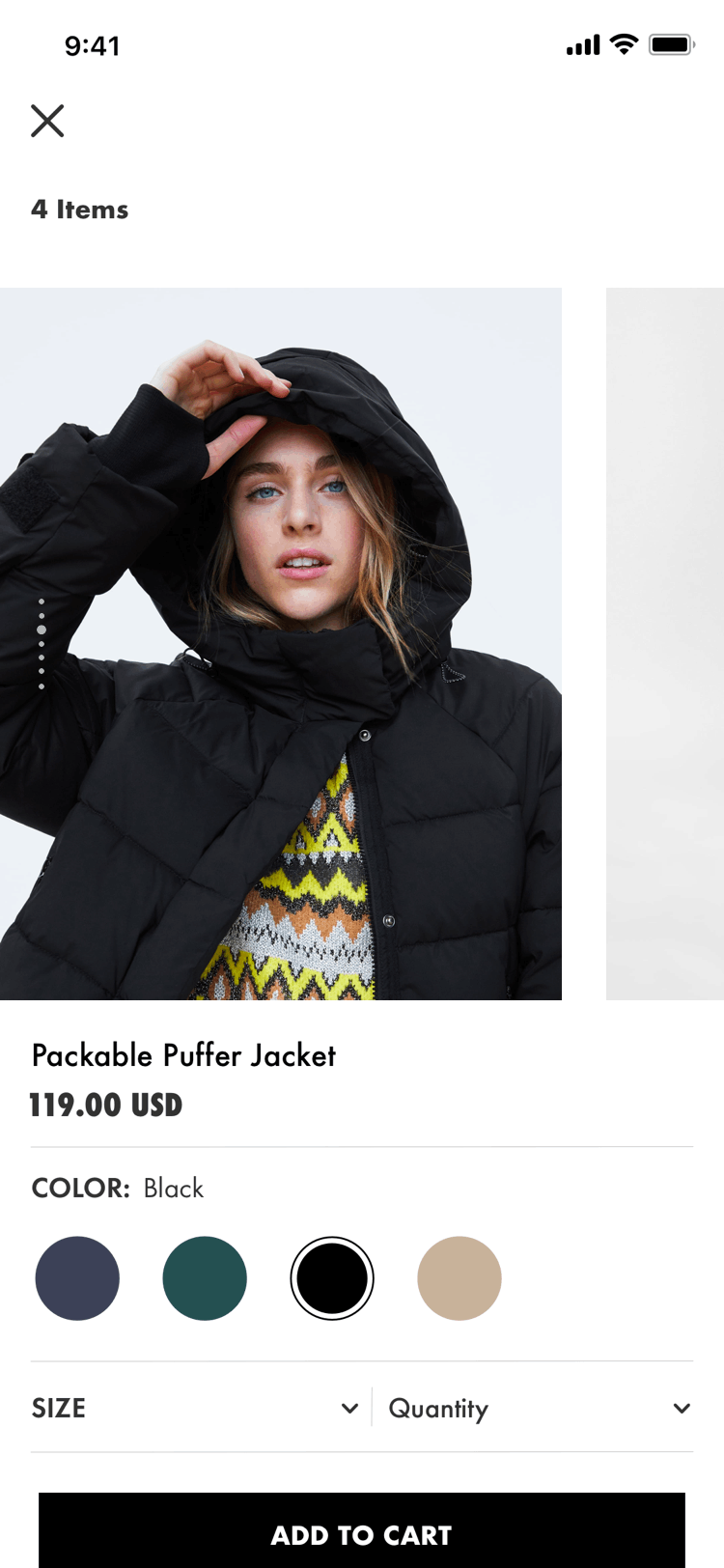
Product
When there are links to the products from the posts, user can navigate to product page where they can change color to see different options available for them. For those products uploader tags into third party websites, user can tap the tag information and view on some other websites.

Product Details & Reviews
Since material qualities are of highly priority in users' demand, the product detail page showcases composition of the items and how to do care.
Again, since item materials and comfort is important to users, the review section clearly displays how overall buyers think the item fit whether they run small or big to make sure user can have a good understanding of how to choose the size.

Publish Posts
The main feature for those proactive users who consumes a lot of social media outfit ideas and wish to share their looks through the form of "short videos" and "photos" and can add tags and emojis. User can also hashtag similar communities and tag products both available in shops of the app or other websites.

Search with Keywords
The keyword search is a fundamental way for "active users" to discover what they want. When users open search, there are "top", "yours" and "people" options to choose from as well as image suggestions and trending topics. When users type in keywords, there are list of suggestions, such as number of products and posts. Also in the results page, users can refine by hashtags and suggestions in the feed.

Search with Photos
People can also search similar items with photos they take or from social media sites like Youtube and Instagram. In the future, it might also be possible to look for names of some KOIs on social media sites and generate results of their recommendations.

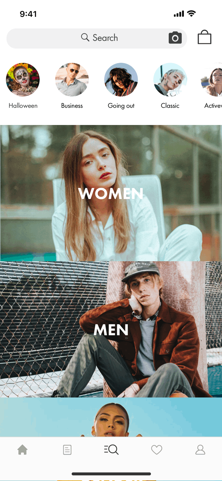
Category
A main category breakdown and search tabs for users. The categories are divided up as "men", "women", "neutral gender", "plus-size" and "sale" based on insights we gathered from the research process.
When users get into the last category, for example, the "CLOTHING" in this case, there are options to shop not only the generic categories such as "jackets" and "tops", but also they can choose by "weather", "mood", "occasion" and "temperature". Of course, these options are also available with keywords directly. The images are carefully selected to display the fun and vibe of young people.

Product Category
When users get inside of one category for products, in this case, the "cold weather", they will see a mix of items and looks. They can further refine and sort the results by product types, colors, ranges and prices to match their personal needs.


Notifications
As there are two main systems at play inside of the app, the social and the e-comm, the notification center is hence divided up to three sections. "Following" and "You" allow users to track what are popular posts people they follow liked or collected and also be able to manage "likes" of their own posts. The wishlist, on the other hand, serves as a place for users to look at products they saved and potentially to buy later.

Account
As the solution of "look" is important to users, the account has three sections for users to manage their posts, save items and looks to boards and track what they have liked. The settings is a general place for users to track their orders and make changes to their account.


Reflection and Next Steps
-
What are some other feed sections can we introduce: add articles? video sections? consult real stylist? and how to better manage the UGC (user-generated contents)?
-
Further study the notification center and find best solutions to deliver updatesUser testing on prototypes to refine the user flow and other usability issues.
-
Inside the product detail/ review page, how should users be more confident about the selection?
-
What are some other things can be introduced to that end?
-
Logistically refine the category of products, perhaps add some recommendation sections and/or sale information for brands and events.